The Transformative Power of Color in Home Design
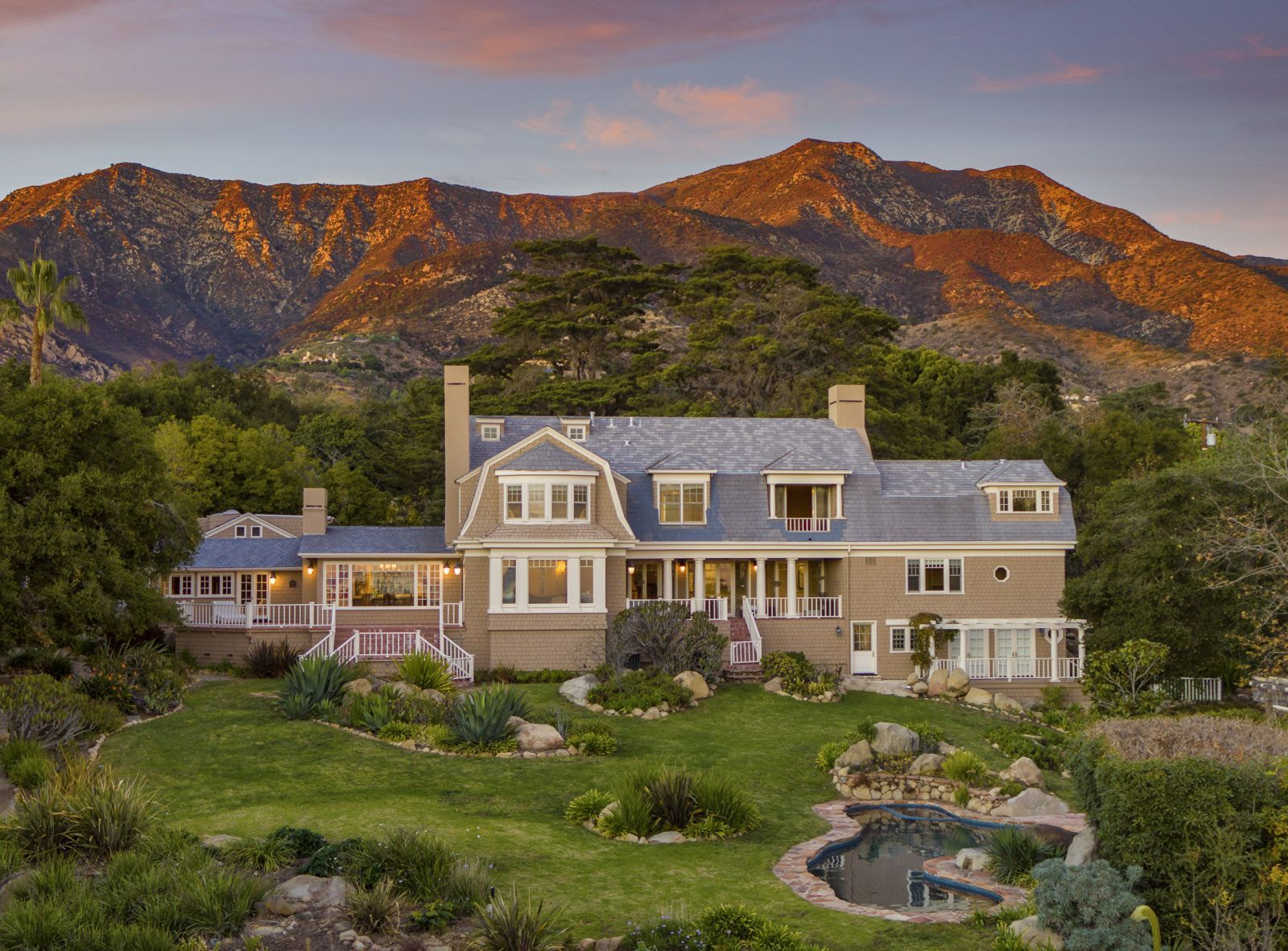
In the realm of home design, color serves as the brushstroke that breathes life into a space, as you can see in the image above of my Exquisite Cape-Cod Style Estate listing. Beyond the exterior, color permeates every aspect of decor, offering a spectrum of emotions from the traditional to the avant-garde. The upcoming year's color trends present a canvas that ranges from calming neutrals to exhilarating bursts of vibrancy, providing a unique opportunity for homeowners to express their individuality through the language of color.
The Emotional Tapestry Woven by Home Color
The significance of color extends beyond the visual; it is a language that resonates emotionally within the confines of our homes. With the power to sway thinking, alter actions, and provoke reactions, the right color palette becomes a transformative force. Whether the goal is to create a serene sanctuary or an invigorating space, the carefully chosen hues of 2024 offer the tools to curate a home that genuinely reflects its inhabitants.

Pantone's Radiant Vision for 2024
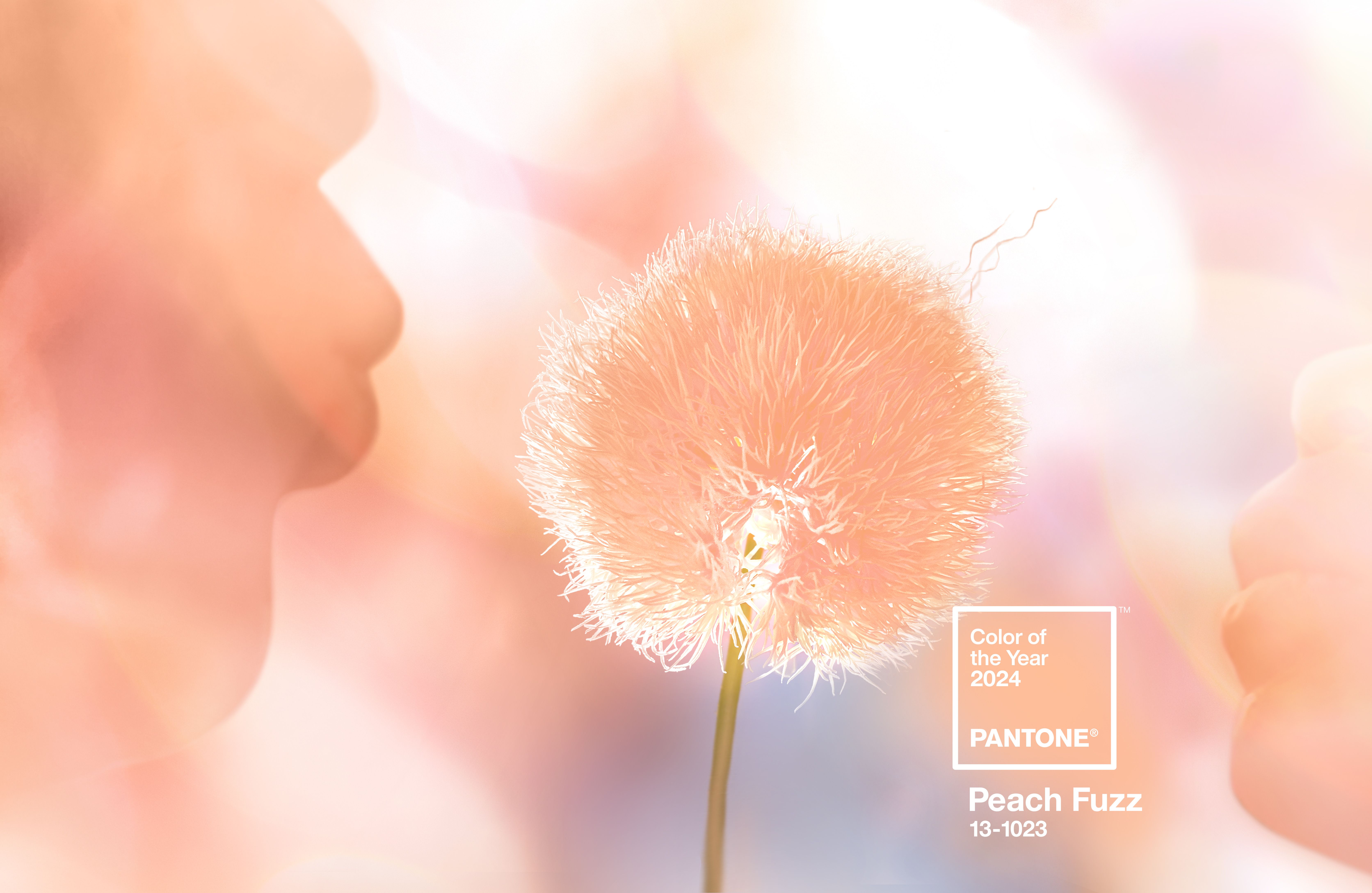
At the forefront of color forecasting, Pantone introduces Peach Fuzz as the Color of the Year for 2024. This heartfelt peach hue is selected to bring a feeling of tenderness and communicate a message of caring and sharing, community, and collaboration. Leatrice Eiseman, the executive director of the Pantone Color Institute, describes it as a shade that resonates with compassion, offering a tactile embrace and effortlessly bridging the youthful with the timeless. Check out this story on houzz for ideas on how to incorporate this soft shade of orange in your Santa Barbara home.
Diverse Picks by Other Experts for 2024
The color choices of other paint companies promise versatility and style for every homeowner:
- Benjamin Moore ventures into the cosmos with Blue Nova (825), a blue-violet blend that beckons adventure and new experiences. The cosmic, blue-violet blend encourages adventure, symbolizing a yearning for new experiences and a willingness to indulge in the unknown.
- Sherwin-Williams unveiled Upward (SW 6239) as its designated Color of the Year, and this serene blue effortlessly encapsulates the feeling of inhaling a leisurely breath of crisp, fresh air. The company chose this palette because it doesn't overwhelm a space. Instead, it fosters meditation and tranquility. The light blue hue, adorned with subtle gray undertones, is particularly well-suited for cultivating a coastal chic design aesthetic. Upward can be artfully employed as a standout color in bathrooms or kitchens, enhancing the seaside vibe. Alternatively, in a serene bedroom setting, it serves as a revitalizing accent wall, adding a touch of freshness and calm to the overall ambiance.
- Valspar's Renew Blue draws inspiration from Santa Barbara's coastal hues, offering a tranquil light blue ideal for mixing and matching. Renew Blue is chosen to evoke the calming and serene nature of Santa Barbara's coastal landscapes, creating a versatile and soothing palette for any home.
- Behr named Cracked Pepper (PPU18-01) as the color of 2024. This soft black hue provides a timeless anchor adaptable to various design styles. Selected as an approachable segue into the darker side of the color spectrum, Cracked Pepper melds seamlessly into any design style, offering a classic and enduring touch.
- Dutch Boy Paints unveils Ironside, a deep olive shade with black undertones, merging moody mystery with comforting appeal. Ironside offers homeowners a way to exude moody mystery vibes while providing a comforting atmosphere, offering a versatile color that complements any room without overwhelming.
- Glidden, under PPG, has declared Limitless (PPG1091-3) as its pick. Described as a honey beige hue, the brand emphasizes that it is "anything but yellow," possessing the endurance of a primary color coupled with the adaptability of a neutral shade. The company noted that this choice came from the evolving trend of consumers exploring color in increasingly unconventional ways and emphasized the need for a versatile palette that seamlessly integrates with new and existing decor.
- C2 Paint's Thermal (#752) is perfect for the Santa Barbara lifestyle we hold so near and dear to our hearts. The refreshing blue is reminiscent of a clear sky, encouraging a calm and uplifting atmosphere. Thermal is selected as a bespoke pale yet punchy blue poised for adventure, symbolizing loyalty, trust, and confidence, providing a call to action to live boldly and express unique styles freely.
A Symphony of Hues
Read this article in House Beautiful for more Color of the Year 2024 choices. They've even laid out some ideas on bringing the colors into your home to kickstart your creative flow with hues that evoke comfort, versatility, and a continued connection to nature.
Considerations for Home Sellers and Buyers: For those contemplating the sale of their homes, a fresh coat of paint aligned with the latest color trends becomes a strategic move to enhance appeal. As a distinguished Santa Barbara Realtor, I bring invaluable insights into the local real estate market. Those searching for a new home can explore my portfolio of current listings by reaching out at (805) 886-9378 or Cristal@montecito-estate.com.
Of Related Interest: